
Preparing your print…Warming up the printer…Your print is on its way…Applying finishing touches…Almost ready…Printing with care…Generating sharp details…Finalizing your order…
A practical, print-floor guide to choosing GSM, finish and paper type for business cards, brochures, posters and packaging in India.
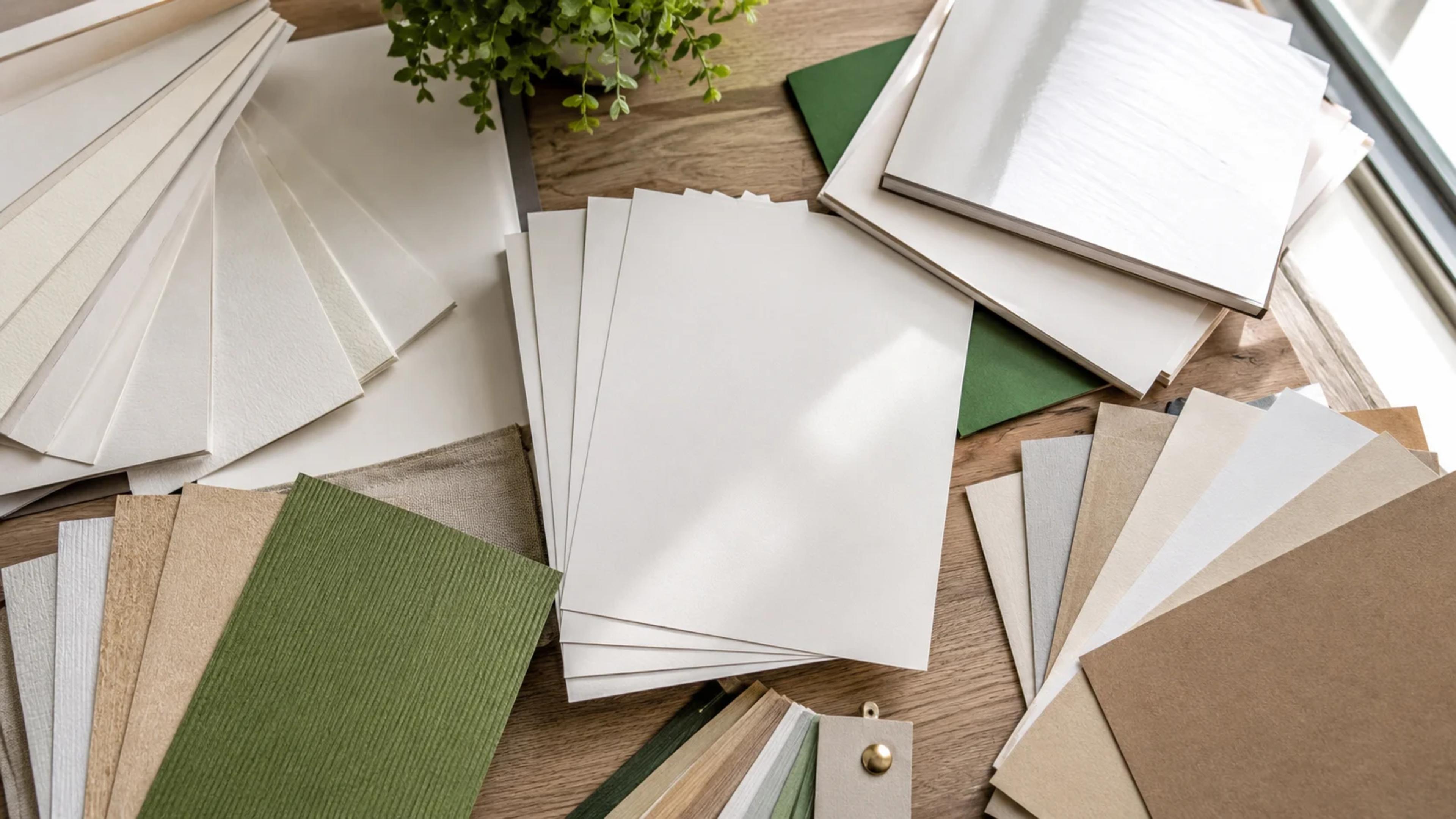
Walk into any print shop with just \"good quality paper\" as your brief and you'll get whatever the operator has lying around that week. Paper selection isn't one decision — it's three: weight, coating, and finish — and getting any one wrong shows up immediately, whether that's a brochure cracking at the fold or a poster fading in a week of Mumbai humidity. This guide walks through how to pick correctly for the job in front of you, not just the job that sounds premium.
Before GSM or finish, ask how the piece will be handled. A business card lives in a wallet and gets touched daily — it needs stiffness and a wipeable surface. A flyer handed out at a mall kiosk might get read once and binned — spending on 300 GSM stock there is wasted money. A menu card in a restaurant gets spills, grease and repeated wiping — it needs lamination, not just good paper. Match the spend to the lifespan and handling, not to what sounds impressive on a quote.
GSM (grams per square metre) tells you how heavy the sheet is, and heavier generally means stiffer and more opaque. But GSM alone doesn't tell you about coating, brightness or texture — two 170 GSM sheets from different mills can feel completely different in hand. Use GSM as a starting filter, then check the coating and finish before finalising.
GSM Range | Feel | Typical Use |
|---|---|---|
70-90 GSM | Light, like copier paper | Letterheads, internal forms, flyers for one-time handouts |
100-130 GSM | Slightly stiffer, standard brochure feel | Brochures, single-fold flyers, catalogues |
150-170 GSM | Noticeably sturdy, doesn't show through | Posters, tri-fold brochures, menu cards without lamination |
250-300 GSM | Card-like, holds its shape | Business cards, postcards, invitation cards |
350 GSM+ | Premium, rigid | Luxury invitations, packaging inserts, premium business cards |
This is the decision that affects print quality more than GSM does. Coated paper (often called art paper) has a thin clay or polymer layer that stops ink from soaking in, which is why photographs and solid colours look sharp and saturated on it. Uncoated paper (bond paper, natural stock) lets ink absorb slightly into the fibres, giving a softer, more matte look — better for text-heavy pieces, letterheads, and anything meant to be written on. If your design is mostly photography or bold colour blocks, go coated. If it's mostly type, or the paper needs to take a pen, stamp or signature, go uncoated.
Once you've settled on coated stock, the finish decides how it behaves under light. Glossy finish reflects light and makes colours look vivid and saturated — great for photography-led brochures and product catalogues, but it glares under fluorescent office lighting and shows fingerprints fast. Matte finish diffuses light, so colours look slightly muted but the surface stays smudge-resistant and easier to read text on — the safer default for business cards, reports and anything text-heavy. Silk (sometimes called satin) sits between the two: less glare than gloss, more vibrancy than matte, and is popular for premium brochures and annual reports where you want both photography and long paragraphs to read well.
250-350 GSM with matte or soft-touch lamination is the standard. Letterheads should stay uncoated at 90-100 GSM so pens and stamps sit properly — a coated letterhead looks odd once signed.
130-170 GSM coated paper is the sweet spot for single sheets. For multi-fold brochures, stay under 170 GSM — anything heavier cracks visibly at the fold line after a few opens, especially with cross-grain folding, which is a common mistake shops make when rushing an order.
170-300 GSM depending on size and display duration. Indoor posters for a week-long sale can use 170 GSM matte; posters meant to stay up for a season should move to 250 GSM or get laminated to resist handling damage.
Paper isn't the right material here at all — flex, vinyl or Correx board handle sun and rain in a way no paper stock can. If a client asks for a \"banner\" but means an indoor pull-up stand, laminated 300 GSM art paper mounted on a stand works fine.
250-450 GSM board, often kraft-based for an eco-friendly look or SBS (solid bleached sulphate) board for retail-ready packaging with sharp print quality. Structural strength matters more than surface finish here, so GSM and board type get chosen based on what the box needs to carry.
When a quote comes in noticeably lower than others for the same GSM, ask what the coating is — some vendors will quote 130 GSM but use a lower-brightness, thinner-coated stock that looks duller under print. Also ask if the GSM quoted is the finished (laminated) weight or the base paper weight before lamination; some shops quote the higher laminated number to make base stock sound heavier than it is. A five-minute phone call clarifying this saves reprint costs later.
Decide how long the piece needs to survive and how it will be handled — one-time flyer versus daily-use card versus outdoor display.
Pick a GSM range from the table above based on that lifespan.
Choose coated stock for photography and colour-heavy design, uncoated for text-heavy or writable documents.
Add matte lamination as the safe default finish unless the design leans heavily on bold colour or photography, in which case consider gloss or silk.
For anything outdoor or exposed to moisture, skip paper entirely and ask about synthetic or laminated options.
Paper feels different on screen descriptions than in hand, and a 300 GSM sample from one mill can feel stiffer than another mill's 350 GSM. Before placing any order above 500 pieces, or before using foil, embossing or textured stock, ask for a physical swatch or a small test print. Browse GSM and finish options directly on our business card and brochure pages, or reach out for a swatch pack before your next bulk order — it's a five-minute step that avoids reprinting a thousand pieces.